

Lessons from SPS 2025: How the Industry is Shaping the Future of HMI and SCADA Dashboards
Last week, I had the chance to attend SPS 2025, Europe’s premier industrial automation expo. My goal was simple: observe how other companies approach HMI and SCADA design trends, and collect ideas that could improve THMI’s interface and workflows. I focused on dashboards, data visualization, alarm systems, workflow efficiency, and user interactions, taking plenty of notes, photos, and screenshots along the way.
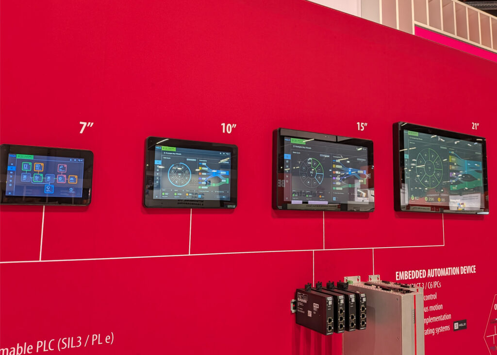
The SPS Landscape: Navigating over 1,200 companies in just two days was an intense task. It was fascinating to see that despite the massive variety of hardware on display, the “design language” of industrial interfaces is becoming remarkably unified, as we all strive to solve the same core usability puzzles.
Walking through the expo, one thing was immediately clear: many companies face the same design challenges we do. Whether it’s visualizing errors, building dashboards, or managing alarms, the core problems are remarkably similar across industries—even when the hardware or focus areas differ.
Here’s what stood out the most.
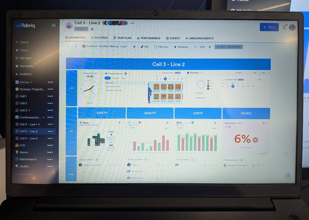
Dashboards Are Now Essential
Dashboards are no longer just a “nice-to-have.” Across the board, companies are putting a huge emphasis on creating unified overviews of complex systems. The challenge isn’t just including a dashboard—it’s making it useful, intuitive, and integrated.
One interesting observation: many dashboards felt forced, added to meet expectations rather than to improve user experience. This reinforced something I already believed: a well-designed dashboard should feel natural and integral, not like a feature added just for the sake of it.
Trends in HMI and SCADA Design
Here are the key design trends I noticed across the industry:
1. Modular Components and Templates
Modern dashboards are moving toward modular, reusable components. Users can drag and drop widgets, apply pre-designed templates, and build dashboards without starting from scratch each time. This modular approach also allows for better organization, grouping related elements into sections or logical blocks.
💡 The Power of 80%. Providing templates that are “80% of what the user wants” allows them to focus on their data while we handle the complex layout and hierarchy.
2. Sections for Better Organization
Using sections or content blocks is becoming standard. This makes complex dashboards easier to navigate and allows users to focus on relevant data without getting overwhelmed.
3. Custom Widgets and Smart Data Visualization
Many systems now allow users to create custom widgets or graphs, tailoring dashboards to their specific needs. Some even automate the layout, letting users focus on selecting the right data while the system handles placement. This balances flexibility with usability, helping users get meaningful insights quickly.
| Feature | Full Manual Control | Fully Automated | The THMI Approach |
| Element Placement | Free-form dragging (can be messy) | Fixed, non-changeable positions | Smart Snapping: Guided grid that keeps elements aligned |
| Visual Design | Every color & font is manually set | Pre-defined, unchangeable styles | Smart Templates: Enforces clean aesthetics while allowing focus on data |
| Complexity | High: Requires design skills | Low: No flexibility | Balanced: Pro tools with intelligent design assistance |
| Outcome | High risk of cluttered screens | Uniform, but potentially rigid | Professional & clean result every time |
4. Intuitive Alarms and Notifications
Alarm systems are being designed to be clear and immediately actionable. Visual cues such as color coding and status indicators help operators quickly identify which alerts require attention, improving response times and reducing stress.
5. Trends as Reusable Widgets
Combining trend views with dashboards is increasingly common. Users want to save trend visualizations as reusable widgets, making it easier to monitor changes and compare data across different dashboards.
6. Scrollable and Responsive Layouts
Scrollable dashboards and responsive, adaptive layouts are becoming standard. Some systems even automate placement of elements so users don’t have to worry about design decisions, ensuring dashboards remain readable and functional across any device.
Takeaways for THMI
SPS 2025 reinforced that great dashboard design is both universal and nuanced. While dashboards are now a baseline expectation, the real challenge is making them intuitive, cohesive, and genuinely helpful.
For THMI, the key lessons are:
- Build modular, reusable components to make dashboard creation simple and consistent.
- Organize content with sections for clarity and focus.
- Enable flexible yet guided data visualization, including custom widgets.
- Make alarms and notifications intuitive, reducing cognitive load.
- Allow trends and historical data to be easily reused and integrated.
- Prioritize responsive, user-friendly layouts for any screen or device.
⭐ The “Liberating” user experience. For non-designers (like many of our integrators), it is liberating to focus solely on the data and connections while the system ensures the final output looks professional and clean.
Ultimately, the goal is not just to check off a feature, but to create dashboards that enhance the entire user experience—dashboards that feel natural, elegant, and truly useful. SPS 2025 offered a lot of inspiration for how to get there, and we’re excited to bring these insights into our future updates.
All products shown in this article are the property of their respective companies. Photos were taken on-site at SPS 2025 expo for editorial purposes only. No endorsement or affiliation is implied.